G10 Top Tax Bracket vs GDP Growth 1948-2010

Growth in the post war period has a positive correlation with the top tax bracket. The growth corresponding to a top bracket above 80 times per-capita GDP annualized growing 4.1%. This is the data shown on the right side of the scatter plot or prior to 1968 on the time series plot. Growth influenced by a top bracket below 80 times has only annualized growing 2.9%. The low bracket data is represented on the left side of the scatter plot or since 1967 in the time series plot.

The breaking point between the high bracket and low bracket periods came when the top bracket was cut to $200,000 in 1965 from $400,000 in 1964. This cut started impacting growth about 3 years later in 1968. Another view of the high bracket and low bracket data is shown in Figure T3.

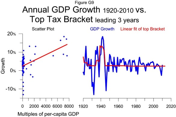
G9 Top Tax Bracket vs GDP Growth 1920-2010

The scatter plot shows that over the last 90 years the top tax bracket has had a positive relationship with growth. This is demonstrated by the upward sloping best fit line in the scatter plot. The strongest year of growth, represented by the highest point in the plot was 1942 which grew 18.5%. This growth corresponds to the top bracket in 1939 of $5 million or 7106 times per-capita GDP.

There have been three distinct multi year periods where GDP annualized growing more than 7%: the early 1920s, the mid 1930s and the early 1940s. All three of these periods correspond with a top bracket of at least $1 million or over 1000 times per-capita GDP. The best growth came with the $5 million bracket.

On the other hand, cutting the top bracket from $5 million to $200,000 corresponds with the weakest year of growth outside The Great Depression.

The significant correlation of the top bracket’s influence on growth in recent years is somewhat hidden by the large variation in the top bracket prior to W.W.II. The post war period is shown separately in Figure G10.

The linear correlation of the top bracket to growth shown here is the first of 3 variables making up the GDP growth model shown in Figure G14. The other two are the influence of the top tax rate and the capital gains rate.

G6 Capital gains vs GDP Growth 1968-2010

This figure shows the curvilinear relationship between economic growth from 1968 to 2010 and the capital gains tax rate. Each point in the scatter plot shows the growth rate for one year with the capital gains rate from 5 years earlier. For example the highest point on the chart show that GDP grew 7.2% in 1984 and that the capital gains rate 5 years earlier in 1979 was 28%.

The best fit curved red line in the scatter plot is used to make the model in the time series plot on the right. The data suggests that a capital gains tax rate of about 29.1% would maximize the growth rate and if the tax rate is above or below that level that growth will be weaker 5 years later.

The weakest growth on the chart, 2009, corresponds with a below optimal 15% capital gains tax rate. The next weakest year, 1982, was influenced by an above optimal 39.9% tax rate.

The influence of the capital gains tax rate on growth is combined with the effect of the top tax rate in Figure G5 to make a model that estimates growth in Figure G7.