The capital gains tax rate leads the exchange traded index of the US dollar by about 7 years. Highs in the dollar in 1985 and 2002 correspond with highs in the capital gains tax rate in 1978 and 1995 respectively. The correlation suggests the dollar will remain weak for the next 7 years.
Tag Archives: leading indicator
G15 Tax Policy vs Long Term Growth 1920-2010
 Almost all the major long term trends in growth of the last 90 years appear to be largely explained by tax policy including: the strong growth in the early 1920s, the collapse into the Great Depression, the phenomenal growth of W.W.II, the collapse after the war, as well as most of the turns in the last 40 years. The five year rate of growth is shown in black. The five year growth rate estimated by the model in Figure G14 is in red.
G14 Tax Policy vs GDP Growth 1920-2010
 Here is the annual GDP growth rate since 1920 in black. The red line shows a three factor regression model. This tax policy model includes the influences of the top bracket from Figure G9, the top marginal rate from Figure G12 and the capital gains tax rate from Figure G13.
The model accounts for the linear correlation of the top bracket, the curvilinear correlations of the two tax rates and how the curvilinear correlations change as the top bracket rises. This model estimates that the current baseline growth rate for the economy is 1.1%.
The annual growth fluctuates much more than the growth predicted by tax policy. Many of the other factors affecting annual growth may have little effect on the long term trend. Looking at the growth rate over 5 year periods as shown in Figure G15 may show more clearly the impact of tax policy on long term growth.
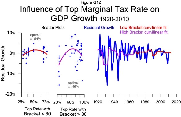
G12 Top Marginal Rate vs GDP Residual Growth1920-2010
 The two scatter plots show the curvilinear relationship between the top rate and residual growth for the data when the top bracket was above and below 80 times per-capita GDP. The charts use the same two year lead time as previous charts showing the relationship between the top rate and growth.
The red curvilinear fit line from the left scatter plot is the basis for the growth estimate shown in red on the time-series plot. The violet curvilinear fit line in the right scatter plot is the basis for the growth estimate shown in violet on the time-series plot.
The violet and red lines together show the influence of the top marginal tax rate on growth for the last 90 years. This influence combined with the influence of the top bracket and capital gains rate make the model in Figure G14.
The residual growth is the actual growth less the influence of the top bracket; its construction is shown in Figure G11. The fastest year of residual growth was 1923 which grew 9% faster than the estimate based on the top bracket. This year corresponds to the 73% top rate in 1921.
Having the top rate estimate residual growth makes for a more natural combination of the two data ranges with different brackets. The different ranges for the top bracket are shown in Figure T3.
G10 Top Tax Bracket vs GDP Growth 1948-2010
 Growth in the post war period has a positive correlation with the top tax bracket. The growth corresponding to a top bracket above 80 times per-capita GDP annualized growing 4.1%. This is the data shown on the right side of the scatter plot or prior to 1968 on the time series plot. Growth influenced by a top bracket below 80 times has only annualized growing 2.9%. The low bracket data is represented on the left side of the scatter plot or since 1967 in the time series plot.
The breaking point between the high bracket and low bracket periods came when the top bracket was cut to $200,000 in 1965 from $400,000 in 1964. This cut started impacting growth about 3 years later in 1968. Another view of the high bracket and low bracket data is shown in Figure T3.
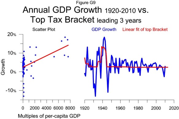
G9 Top Tax Bracket vs GDP Growth 1920-2010
 The scatter plot shows that over the last 90 years the top tax bracket has had a positive relationship with growth. This is demonstrated by the upward sloping best fit line in the scatter plot. The strongest year of growth, represented by the highest point in the plot was 1942 which grew 18.5%. This growth corresponds to the top bracket in 1939 of $5 million or 7106 times per-capita GDP.
There have been three distinct multi year periods where GDP annualized growing more than 7%: the early 1920s, the mid 1930s and the early 1940s. All three of these periods correspond with a top bracket of at least $1 million or over 1000 times per-capita GDP. The best growth came with the $5 million bracket.
On the other hand, cutting the top bracket from $5 million to $200,000 corresponds with the weakest year of growth outside The Great Depression.
The significant correlation of the top bracket’s influence on growth in recent years is somewhat hidden by the large variation in the top bracket prior to W.W.II. The post war period is shown separately in Figure G10.
The linear correlation of the top bracket to growth shown here is the first of 3 variables making up the GDP growth model shown in Figure G14. The other two are the influence of the top tax rate and the capital gains rate.
G6 Capital gains vs GDP Growth 1968-2010
 This figure shows the curvilinear relationship between economic growth from 1968 to 2010 and the capital gains tax rate. Each point in the scatter plot shows the growth rate for one year with the capital gains rate from 5 years earlier. For example the highest point on the chart show that GDP grew 7.2% in 1984 and that the capital gains rate 5 years earlier in 1979 was 28%.
The best fit curved red line in the scatter plot is used to make the model in the time series plot on the right. The data suggests that a capital gains tax rate of about 29.1% would maximize the growth rate and if the tax rate is above or below that level that growth will be weaker 5 years later.
The weakest growth on the chart, 2009, corresponds with a below optimal 15% capital gains tax rate. The next weakest year, 1982, was influenced by an above optimal 39.9% tax rate.
The influence of the capital gains tax rate on growth is combined with the effect of the top tax rate in Figure G5 to make a model that estimates growth in Figure G7.
G5 Top Marginal Rate vs GDP Growth 1968-2010
 This figure shows the curvilinear relationship between economic growth from 1968 to 2010 and the top marginal tax rate. Each point in the scatter plot shows the growth rate for one year with the top tax rate from two years earlier. For example the highest point on the chart show that GDP grew 7.2% in 1984 and that the top tax rate two years earlier in 1982 was 50%.
The best fit curved red line in the scatter plot is used to make the model in the time series plot on the right. The data suggests that a top tax rate of about 54% would maximize the growth rate and if the tax rate is above or below that level that growth will be weaker two years later.
The influence of the top tax rate on growth is combined with the effect of the capital gains tax rate in Figure G6 to make a model that estimates growth in Figure G7.
G4 Tax Policy vs Long Term Growth 1984-2010
 The major fluctuations in the long term rate of growth over the last 27 years correlate with tax policy. The last data point on the black GDP growth line shows the annualized rate of growth for the five years 2006-2010 at 0.9%. The corresponding point on the red line, estimating 1.2% growth is calculated from the estimates for 2006-2010 shown in Figure G3.
The model suggests the 5 year periods 2008-2012 and 2009-2013 will annualize growing 0.8%.
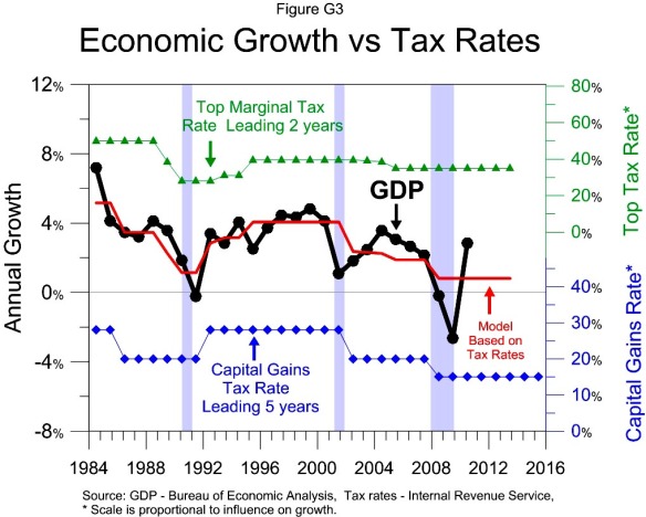
G3 Tax Policy vs GDP Growth 1984-2010
 At a given tax bracket there is a growth optimizing top tax rate and capital gains tax rate. Since 1984 both tax rates have been below the growth maximizing level. The top rate (in green) leads growth 2 years. The capital gains rate (in blue) leads growth 5 years. Every tax rate cut in the chart corresponds with weaker growth while tax increases correspond to stronger growth. The model (in red) shows the combined influence of the two tax rates on growth. It predicts a baseline growth rate of 0.8% going forward.
The strongest growth in 1984 corresponds with the highest tax rates in the period, 50% top rate and a 28% capital gains rate. The great recession corresponds to the lowest combination of tax rates. The Recession of 1990 corresponds to the next lowest combination.
Volatility in annual GDP growth may mask the significance of tax policy’s impact on growth. Figure G4 shows the growth rate over 5 year periods and the rate predicted by tax policy.
Looking back prior to 1984 requires showing the curvilinear relationships between growth and tax rates shown in Figures G5 – G8.
Looking back prior to 1968 requires examining growth’s relationship with the top tax bracket and how the top bracket influences the growth optimizing tax rates, as shown in Figure T2 and Figures G9 –G15.

